All statistics courtesy of BrightMLS.
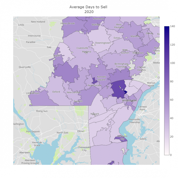
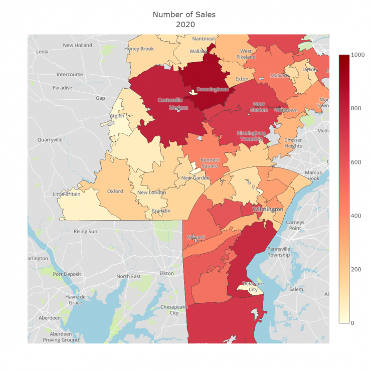
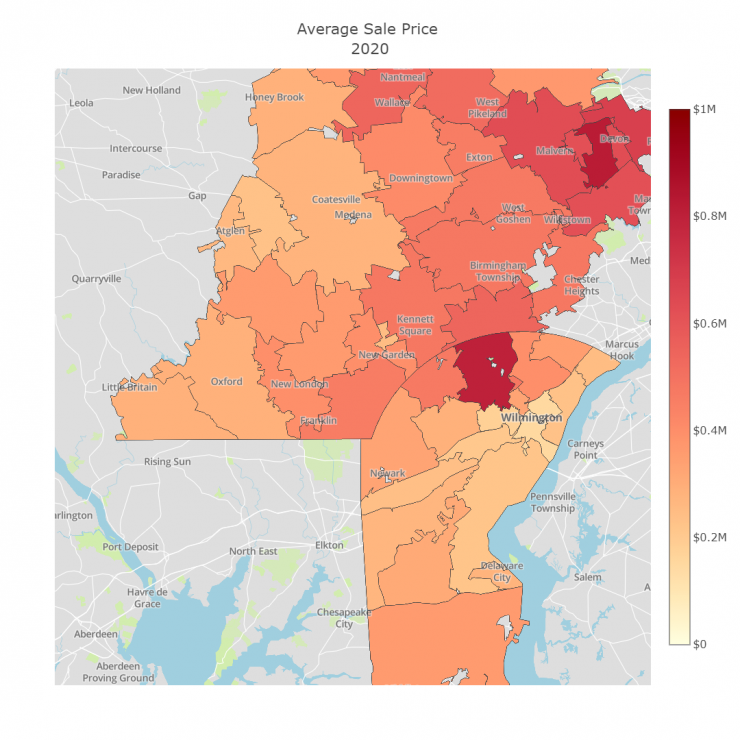
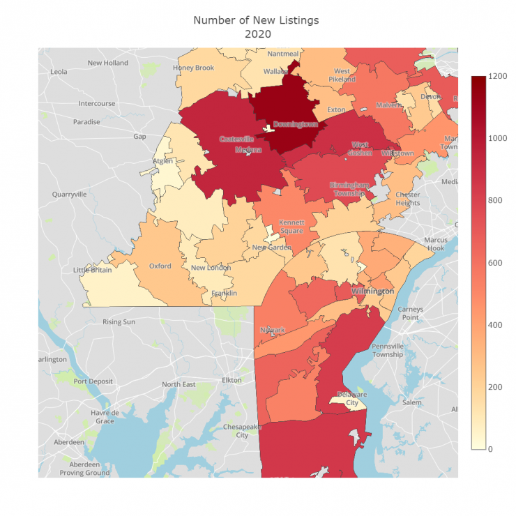
One of the nice looking graphs is the choropleth map. This lets you more easily see more areas and their relationships with one another on a much more easily readable manner. Here are the 2020 end of year choropleth maps.
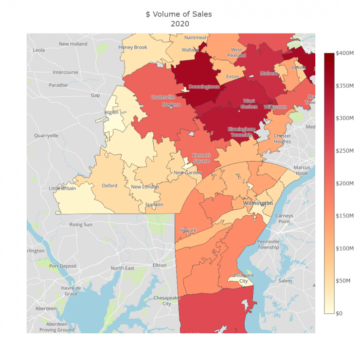
As is often the case, the areas toward Philadelphia had the higher dollar volume of sales. Let's take a look at number of sales and see if that is also higher in those areas.
Now that we have seen what was selling most, let's take a look at where the most new listings were popping up.
Finally, let's take a look at time on the market. In theory, like sales and new listings often being inline with one another, sale price and average days to sell are often similar as well. Let's see if that holds true this last year.